Boundary Editorial — UX & Website
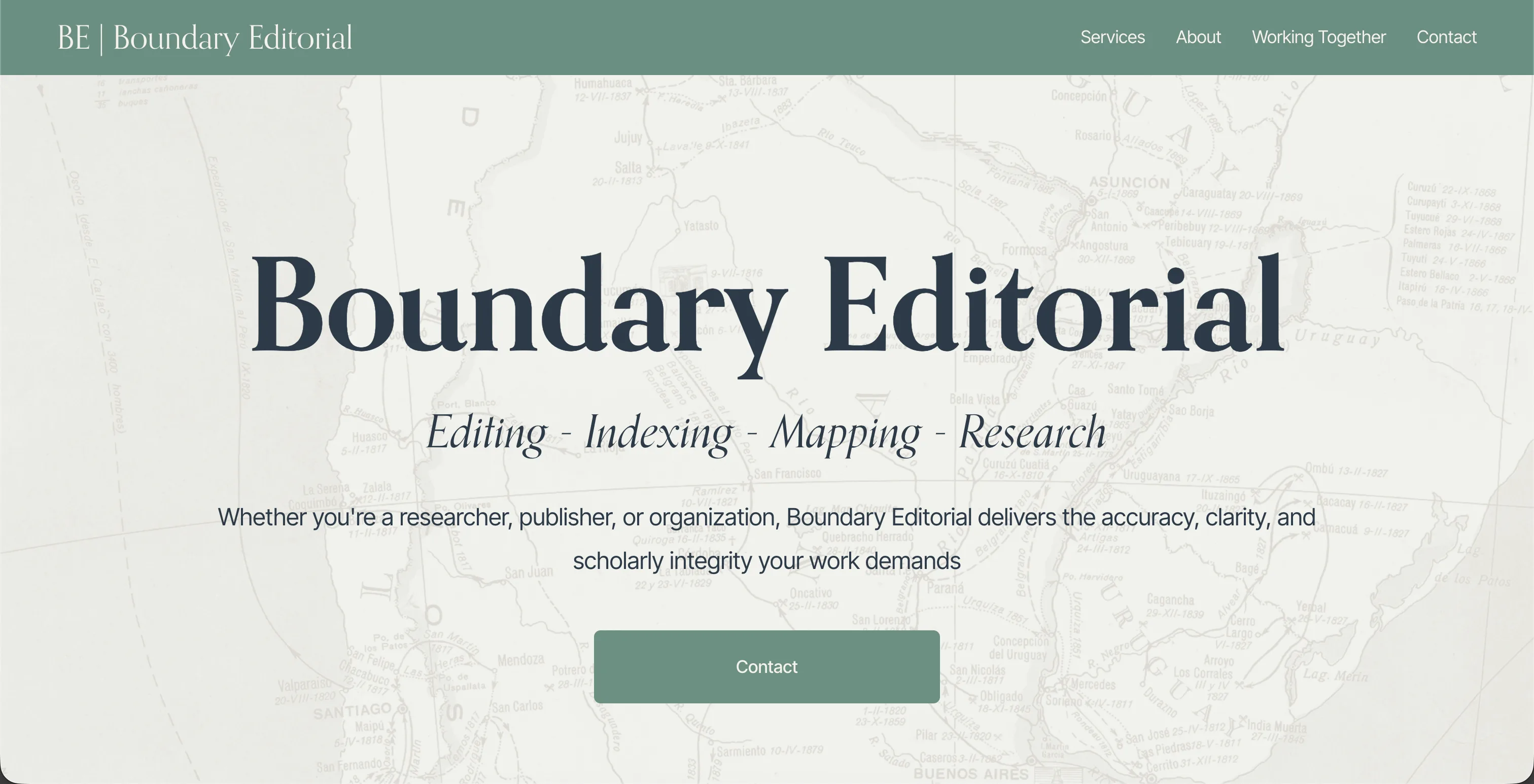
A UX review and redesign of an existing Squarespace site for a boutique academic editing practice — surfacing Michelle's credentials more clearly, reducing friction for prospective clients, and creating a site that reflects the quality and depth of the work she does.
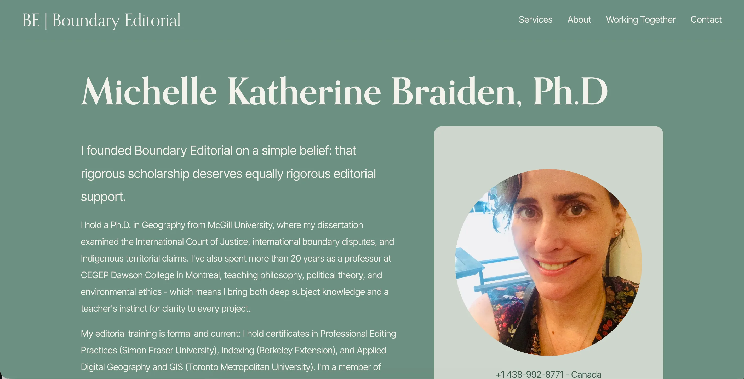
Visit live siteBoundary Editorial is the practice of Michelle Braiden — a scholar-editor with a PhD in Geography from McGill, over two decades of teaching experience, and formal editorial credentials across structural editing, copy editing, proofreading, indexing, and GIS work. Her expertise is substantial, and her existing Squarespace site simply wasn't doing justice to it.
The existing site had real strengths — a clear service offering, a distinctive personal voice, and honest, direct writing. But structural issues were undermining the experience for potential clients: credentials appeared in triplicate across the homepage, navigation anchors created a confusing sense of direction, and there was no clear pathway guiding a visitor from interest to enquiry. The project focused on resolving these friction points within the existing Squarespace infrastructure, without a rebuild from scratch.
Approach
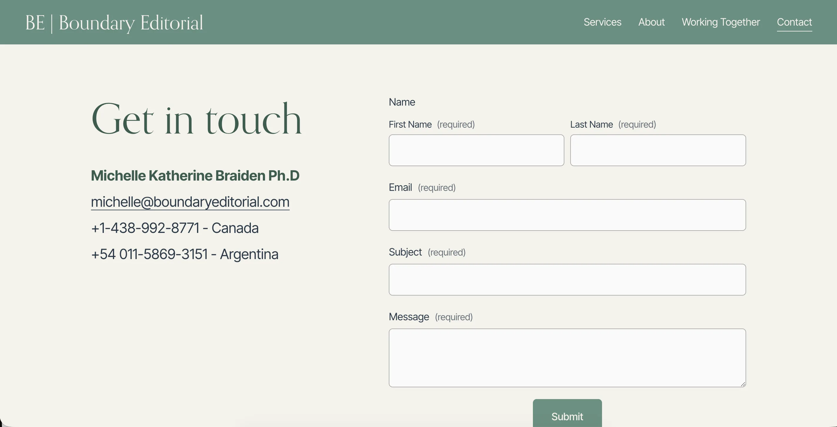
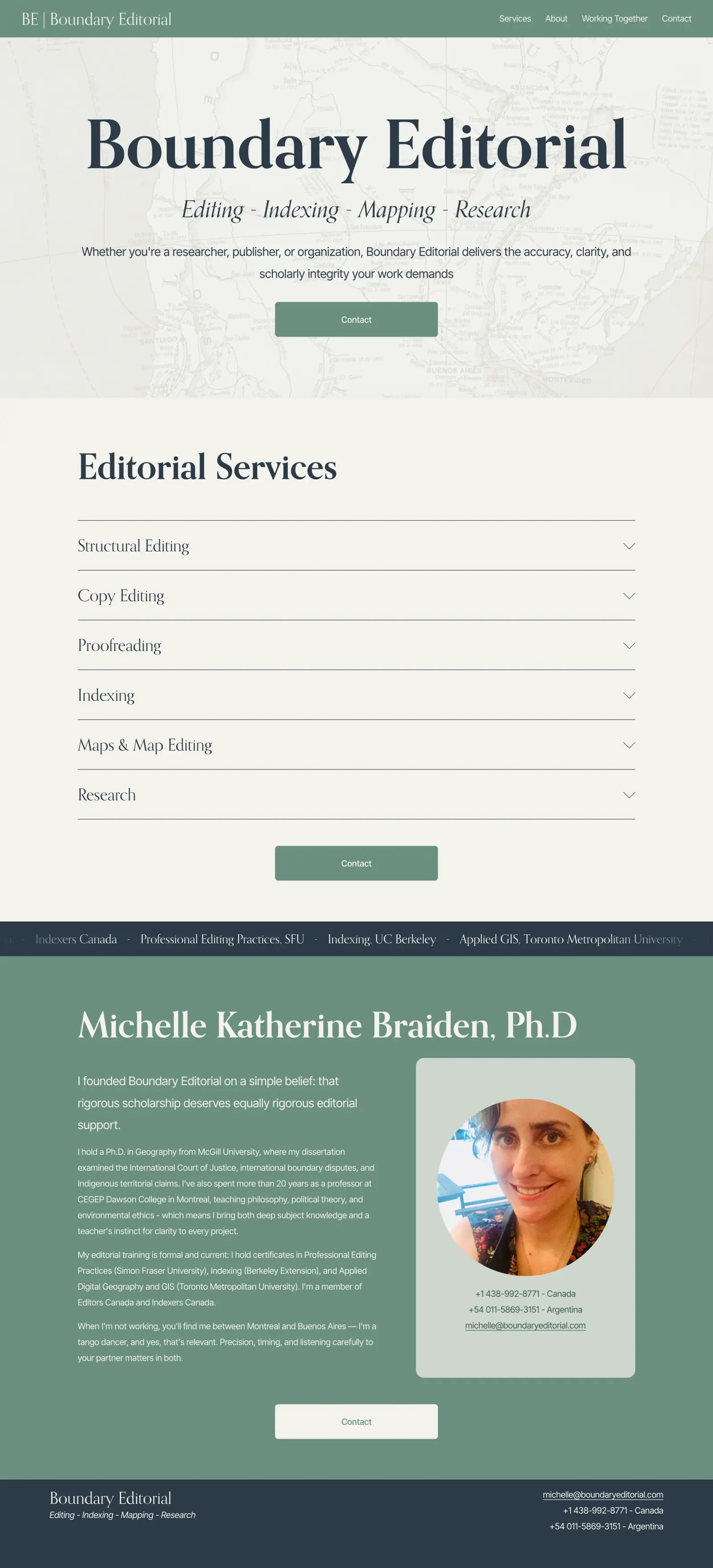
The starting point was a thorough audit of the existing site — mapping every page, every anchor, every point where a prospective client might stall or drop off. The homepage was restructured to present Michelle's credentials once, clearly, and in a sequence that builds credibility rather than repeating it. Navigation was converted from anchor-based scrolling to proper page routing, eliminating the disorientation that came from links that appeared to navigate but didn't.
Rather than a ground-up rebuild, the redesign worked within the constraints of the existing Squarespace setup — which meant changes had to be precise and deliberate, with no room for overengineering. The focus was always on the client experience: how quickly can someone visiting this site understand what Michelle does, trust that she is exceptional at it, and know how to take the next step.
"I'd been living with the site for so long that I'd stopped seeing its problems. Maksym came in, identified exactly what wasn't working, and fixed it — the result is a site that finally feels like a proper reflection of my practice and the standard I hold myself to."
Michelle Braiden
Founder, Boundary Editorial
How We Did It
UX Audit
A systematic review of every page, navigation path, and user journey — identifying where friction lived, where credential duplication was undermining rather than building trust, and where the existing structure was working against the client's goals.
Information Architecture
Navigation restructured from anchor-based scrolling to clear page routing, with each section given a distinct purpose and a logical position in the visitor's journey from awareness to enquiry.
Page Redesign
Homepage and services pages redesigned within Squarespace to present credentials once and with intention — a sequence that builds trust progressively, with a clear call to action at every point where a prospective client is ready to act.