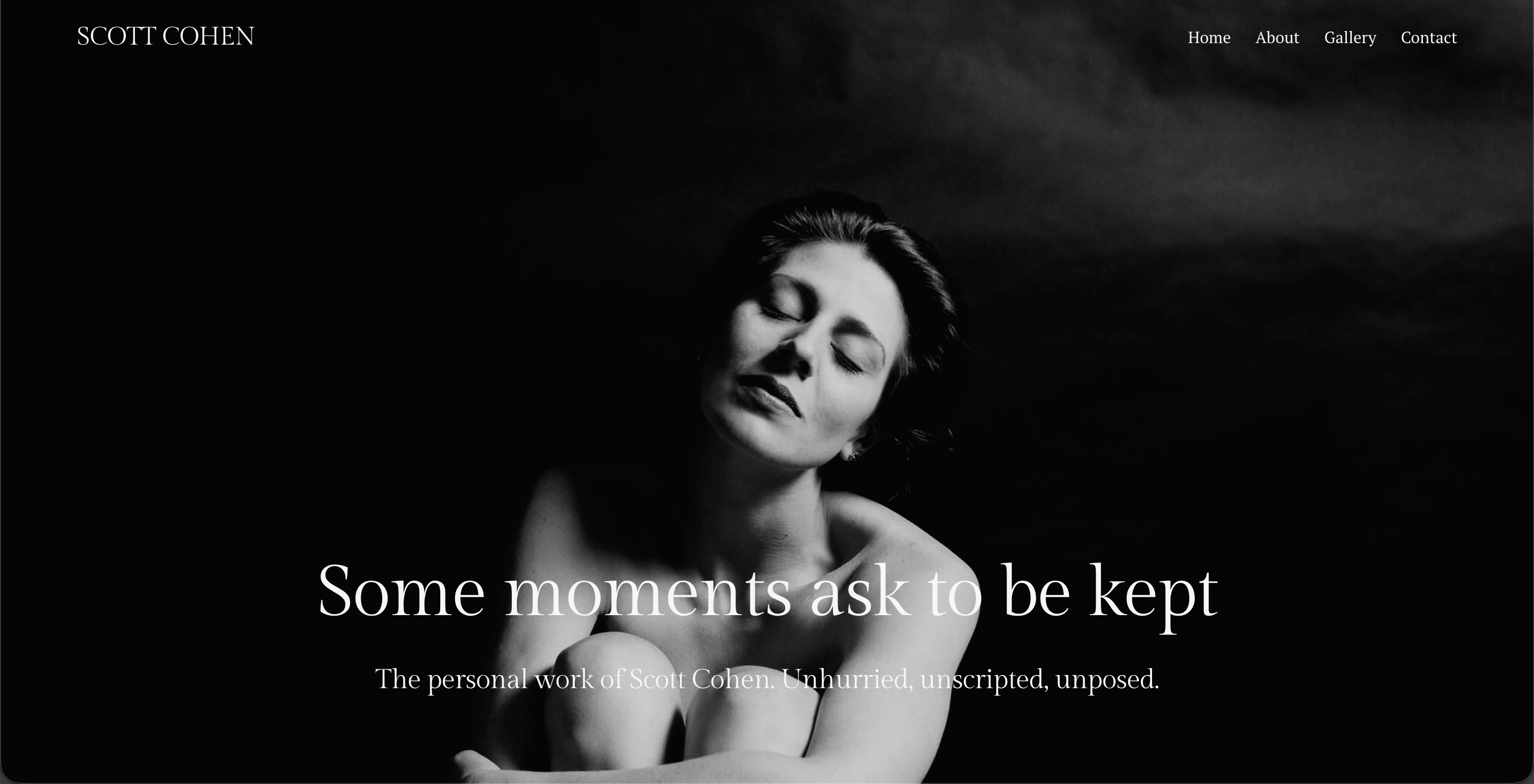
Scott Cohen Photography — UX & Website
UX improvements to an existing Squarespace portfolio for a fine art photographer — better flow, a more responsive layout, and a gallery experience that finally gets out of the way of the work.
Scott Cohen is a fine art photographer whose work focuses on intimate, unscripted portraiture — capturing fleeting moments of light and gesture with the tagline "Some moments ask to be kept." He had a working Squarespace site, but it was basic and functional without being visually compelling — the flow felt disjointed, sections bled off-screen on mobile, gallery images weren't centred properly, and the navigation lacked continuity.
The brief was to improve what was already there: sharpen the UX, fix the responsive issues, and give the site a sense of coherence that matched the quality of Scott's photography.
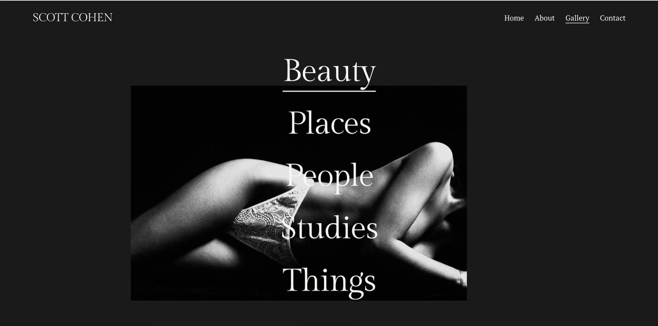
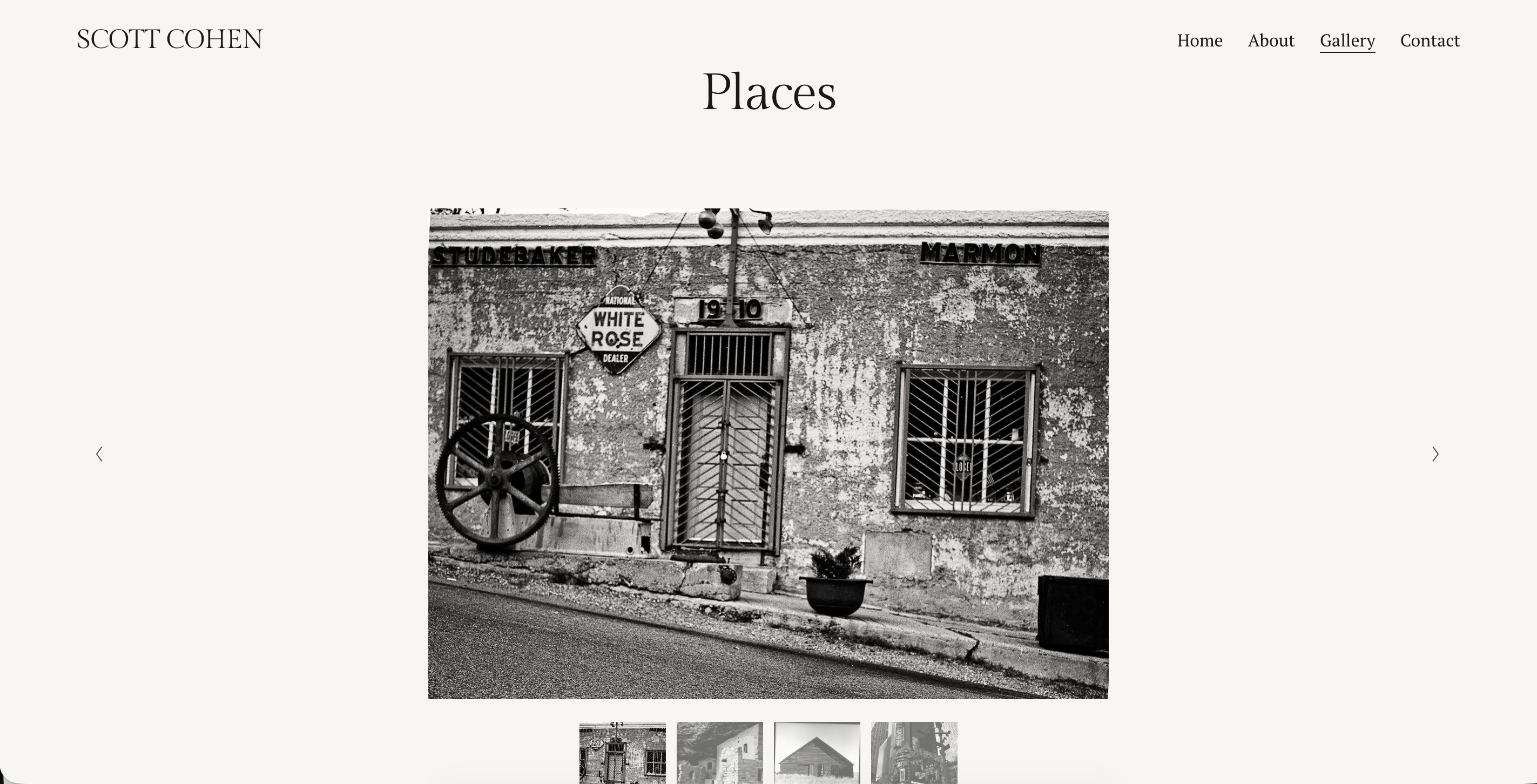
Approach
The work focused on continuity and restraint — improving the sense that each section belonged to the same site, rather than feeling assembled from separate parts. Hero text positioning was adjusted so overlay copy sat below the subject's face rather than competing with it. The gallery slideshow was corrected to center images within the viewport so visitors see the full photo without having to scroll. Horizontal overflow on mobile was tracked down and fixed so the site fits cleanly within the viewport on iPhone, iPad, and large monitors. Navigation hover effects were refined and a clear home path was established. Typography guidance was provided for consistent font use as Scott adds content down the road.
"Maksym helped me with my website, which was basic and functional, but not appealing. He very quickly was able to improve the flow of the website, improved the feel of the page, created a sense of continuity while making it responsive and interesting to look at. Maksym was easy to work with and created an excellent end product. I am thrilled and plan on using him in the future as well for all my website needs."
Scott Cohen
Freelance client
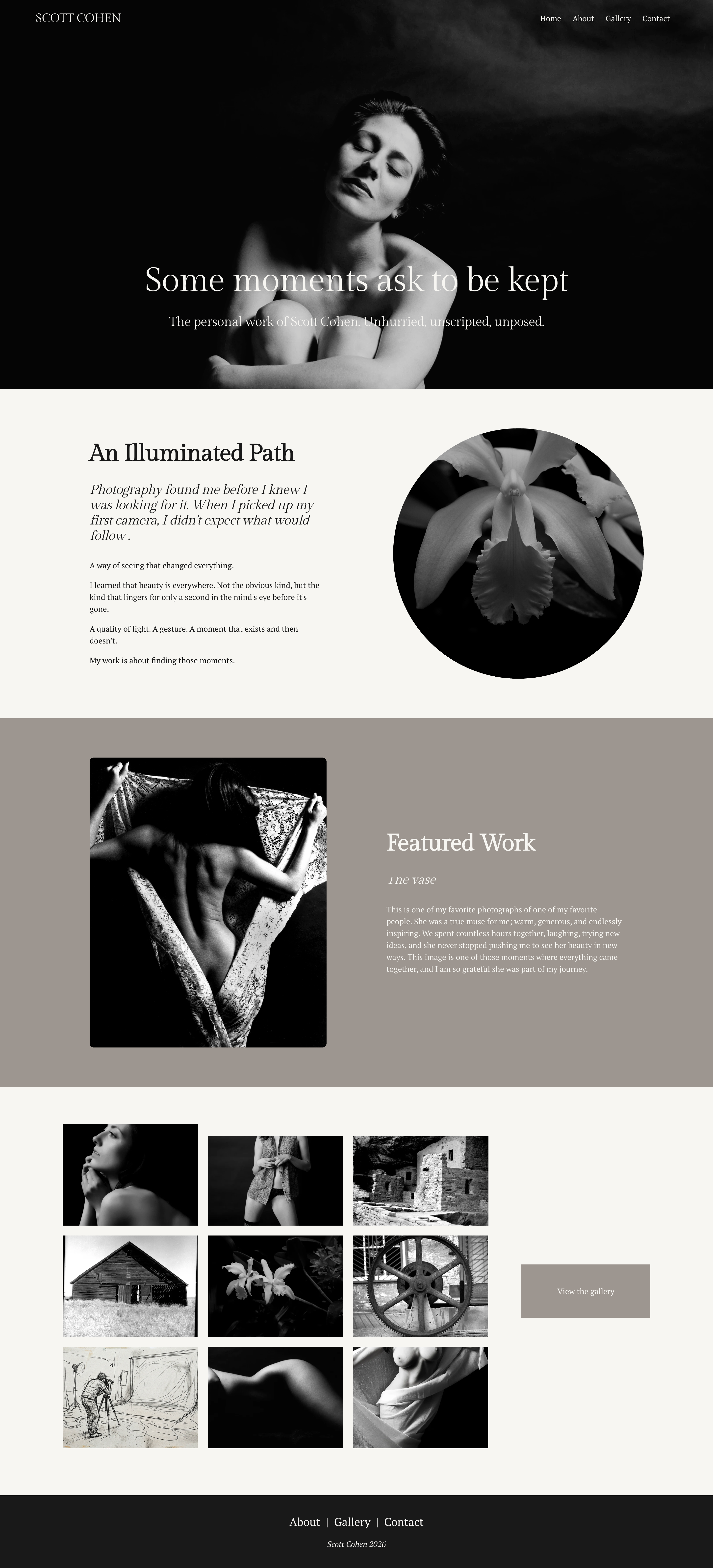
Here's How It Looks
How We Did It
Flow & Continuity
Each section was adjusted to feel like part of the same coherent site — consistent spacing, type treatment, and visual rhythm that carries the visitor through the page without interruption.
Responsive Fixes
Horizontal overflow on mobile identified and resolved. Gallery slideshow images centered within the viewport. Hero text repositioned so it complements rather than competes with the photography.
Navigation & Guidance
Navigation refined with hover effects and a clear home path. Typography and image resolution guidance provided so Scott can maintain and grow the site confidently on his own.